Extreme Website Re-design and De-clutter
Solution
A Website landing page is in need of an extreme facelift. The purpose of the page is to communicate the client’s sustainable program and materials used in the creation of their product, designs communicating this look and feel are to be considered.
Challenge
Redesigning the landing page for the wash care label company and providing a better way to present the heavy content information.
Product Goals
Simple and usable UI, with a great content organization
Easy content navigation to communicate to the client’s the important sustainable materials used in the creation of their product
Too much information on a page
Lack of user interface design and visual design direction.
The pain points to address are:
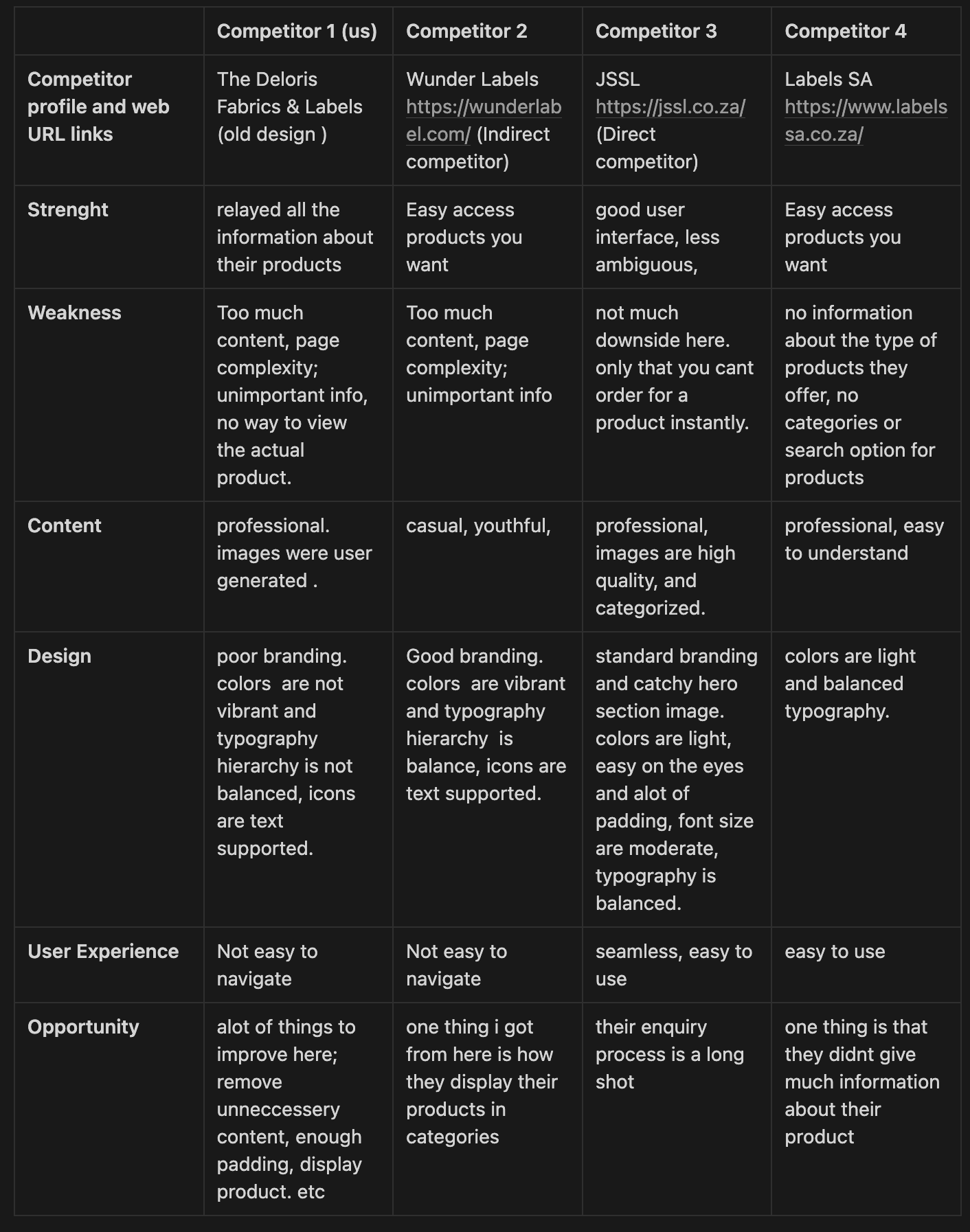
From this competitive audit i got to make layout changes and give the user the option to explore companies products. Also gave it a proper branding and made is less ambiguous.
Findings
UI Changes
source: https://usabilitygeek.com/designing-content-heavy-websites/, https://uxdesign.cc/designing-for-accessibility-is-not-that-hard-c04cc4779d94
I created low-Fi sketches and wireframes as a means to communicate my ideas. This visual design illustrates the layout of the web experience. Here is a rough sketch and a preview of the mobile wireframe. You can view it on the figma file for a better view.
Mobile Wireframe
Research Goals
Find out their direct and indirect competitors
Discover the strenght and weakness of this company as well as other competitors
Thereby Identifying ui/ux needs of the company
Competitive Audit
i performed competitive analysis to see what other existing companies both direct and indirect competitors provide and analyse their problems and success. I will be using a S.W.C.D.UX.O Analysis which is essentially a S.W.O.T analysis but more refined. It stands for:
Strategies and Best practices
Accessibility first
The web is for everyone. Considering accessibility and WCAG requirements when designing your website enables everyone, no matter the disability or range of capability,, to seamlessly interact with the brand. I looked into the accessibility of the design how to make it suitable for all ages and visually impaired people. Defined color contrast, Text visibility, focus states etcetera.
Planning Layout Design
When planning layout design, it is important to make room for white spaces. Since this site is already content-rich, i will need to incorporate as much **white space **as i can, and in a manner that maximizes the aesthetic appeal. it is also incredibly important to take due care in choosing what texts will look like. Readers need to be able to skim content and leave with a takeaway
Incorporate Photos and Artwork
To keep the site clean and simple with plain images. Instead of bombarding users with text upon first glance, let them explore the site using appealing graphics, and discover the content on their own. Using high-quality photos (and optimize them for web)
Neat and Elegant
Information overload **is a huge roadblock for content-heavy websites and can be avoided using a few smart **web design **techniques such as implementing ample **white space **and using boxes or borders to categorize information.
Content Responsiveness
Making the content responsive is another big step toward improving a content-heavy website. The newest trend that websites are expected to accommodate is responsive content for mobile devices, which change and evolve according to what the user wants.
With the strategies i used it helped me make a significant change to the user experiance and Interface design of this website landing page. i made the content more comprehendible by making use of white spaces and highlighting important content. i also made texts and icons more accessible, Button text more contextual, Clear hierarchy of contents, Typography hierarchy balanced, eliminated unnecessary styles and content information.
Moodboard

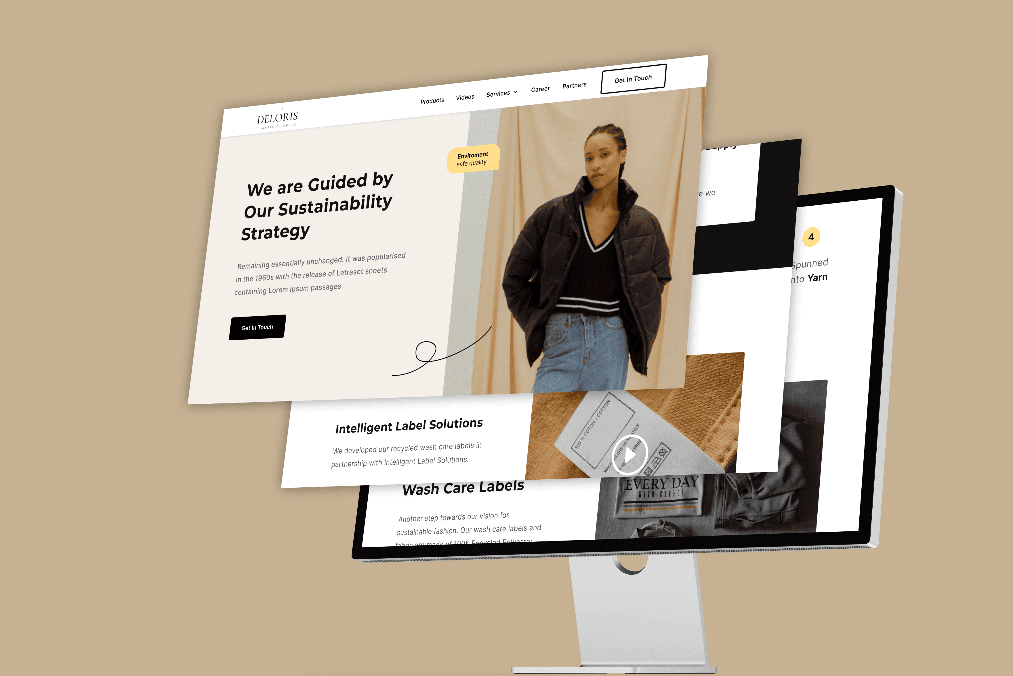
Desktop High fidelity UI design
In this design implemented all the best practices and ui changes to make the landing page more aesthetically pleasing and accessible.


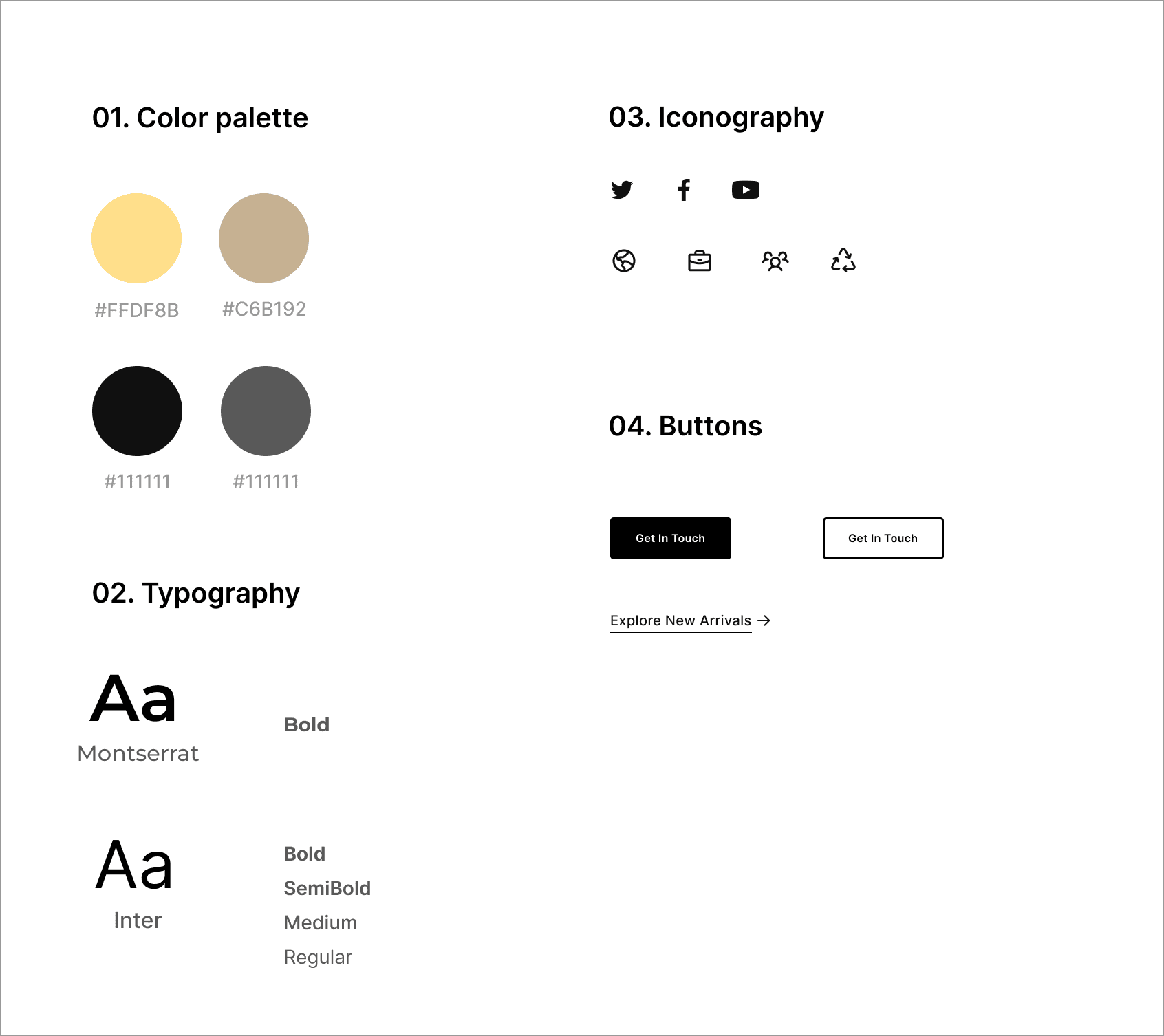
Style Guide

Role
Product designer
Industry
Ecommerce
Date
June 24, 2023
Platform
Website
more work

Kuda Dashboard messaging tiles
read case study

Rethinking WhatsApp status feature
read case study

International Bank Transfer
Send to a foriegn bank account.
Kuda Uk remittance
feature
read case study
I specialize in crafting exceptional digital experiences to help you achieve your business goals. Contact me let's bring your vision to life!